
Deciding on a colour scheme for your kitchen is as much about the size and shape of the room as it is your preferred palette. When it comes to choosing the perfect kitchen colour scheme, the world is your oyster. There has never been such a wide range of colours, tones and shades to choose from. However, the important thing to realise is that it is as much about the shape and size of the room as it is about your palette preferences. There really is a science to it all. Firstly, to understand how the size and shape impacts on the effect of colour choice. Secondly, to take into account how particular colours complement one another. Don’t worry though, it’s not too complicated – and we will take you through everything, step by step.
Kitchen Colour Scheme: Understanding how colour palettes work
If you want to choose the perfect kitchen colour scheme, you need to appreciate how colour palettes work. The first step to creating a great colour scheme is to understand how certain colours complement each other. And the easiest way to do this is to use a colour wheel. The sort of thing that you normally see in school classrooms, a colour wheel is really the biggest secret of great interior design.
Colour wheels are simple but remarkably effective. The fact is this: you won’t find a better way to understand what colour shades work well together. There are two basic ways to use a colour scheme:
To see complementary colours
The straightforward way to use a colour wheel is to look at the two colours that sit opposite to one another. These are the shades that will complement each other. Outside the primary colours of red, yellow and blue; and the secondary colours of purple, green and orange, your options of complementary colours are virtually limitless. Let’s just say that, despite the film title, there are definitely more than ’50 Shades of Grey’ – way more. Indeed, a leading name in the world of colour, Dulux, boasts that it has over 1,200 colours available. That’s a lot of potential complementary colour combinations for your kitchen!
Understanding Analogous colours
The three sections of the colour wheel that sit together are known as analogous colours. This is where you get varying shades of one primary colour, such as dark blue, medium blue, and light blue. Alternatively, an analogous colour can also be a colour that blees into another, such as yellow, yellow-green, and green.

Another way of using a colour wheel is to use a split complementary scheme. This involves the use of three colours. You start with one colour and find its complement. Next you select the two colours either sides of it. For example, red-orange is the complement of blue-green. This means that the split complement of blue-green is red and orange.
Triadic Colour Schemes
As with many other principles of colour theory, triadic colour combinations make use of three colours. However, with a triadic scheme the three colours you select are equally spaced around the colour wheel, rather than being next to or opposite each other.
Simply connect the three triadic colours by drawing the outline of a triangle with sides of equal length. The three colours at the points of the triangle are triadic. To make it simple, there are only four triadic combinations on a basic colour wheel. These are: Red, Yellow, Blue; Red-Orange, Yellow-Green, Blue-Violet; Orange, Green, Violet; Yellow-Orange, Blue-Green, Red-Violet.
A split or triadic choice of colours will result in a diverse palette. It shows that colours that you might not normally or obviously place together can actually work very well together. So, you can see that there are many different approaches to choosing the colours for your kitchen.

Basic types of colour schemes
When it comes to interior design, there are three basic kitchen colour schemes. These embody particular themes. The first of these is a tonal theme. To create a tonal colour scheme, you choose a base colour first and select variations of it to use across the room. This is a popular option for contemporary kitchens. Layering different shades of white can create either a classic traditional look or an ultra-modern look. Alternatively, monochrome and muted looks can be created by using different tones on units, worktops and walls.
A harmonious theme is achieved when you choose colours that are close to each other on the colour wheel. These complement each other without being too similar. Particular colour combinations can create different harmonious kitchen styles. For example, white, green and brown is a classic combination for a country farmhouse style. Meanwhile, grey, white and light blue creates a modern, fresh and clean feel.
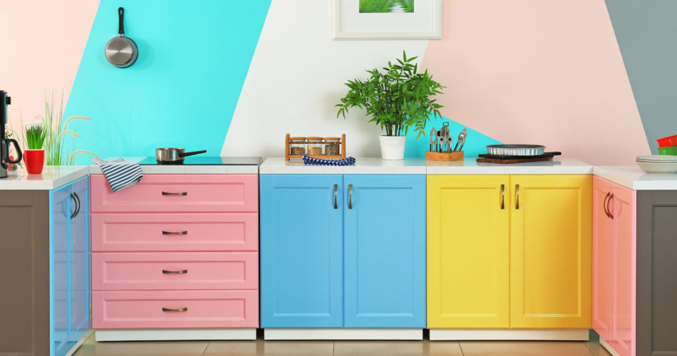
A complementary theme takes a bolder approach. Complementary colour schemes employ opposites that create a real statement in the room. The colours correspond and complement each other. However, with a harmonious colour scheme, the contrast is much stronger and more pronounced. You can create a strong statement with white units and dark coloured walls. For a different effect and a more toned-down approach, try pairing pale coloured walls and. units with a statement, stand-out feature, such as a vividly coloured kitchen island or a brightly coloured oven.
Colour is strongly associated with mood
While there is a definite science behind the theory of kitchen colour schemes, it is important to remember that there are no strict rules. Many homeowners mix different aspects of each theme. In doing so, a truly unique kitchen colour scheme can be created. Ultimately, choosing the colours for your kitchen is largely down to your own personal choice. Whether you have a particular favourite colour or one that holds sentimental value, it doesn’t matter.
However, regardless of your choices, there is still a way to go about choosing your shades. It will stand you in good stead if you consider how closely colour is associated with mood. One simple approach is to think about the mood you want to feel when you are in your kitchen.
For example, if you want to feel calm, the likes of pastel shades and neutral tones create a warm and cosy space, and a soothing environment. An energised look – perfect for a busy family kitchen – can be created by blending glossy shades of white with bright and vibrant colours. For a quirky feel, try mixing unexpected shades. An urban and contemporary feel can be created by using a stripped-down approach and pairing it with a loud statement colour.

The importance of the shape and size of the room
Essentially any colour scheme can be applied to any room. However, you should carefully consider the size and shape of the room – and the amount of natural light that you have – before committing to a particular scheme.
If your kitchen is small, narrow or has a low ceiling, you need to be careful with your choice of kitchen colour scheme. Dark shades will make the room feel oppressive, claustrophobic and smaller than the space really is. This is especially true if you have little natural light too. It is really important to choose colour combinations that incorporate light tints. This introduces aspects of white which will brighten the space. This is even the case if the design does include touches of darker tones as well. Indeed, darker tones don’t need to be avoided completely in smaller spaces. It’s just vital that you don’t overdo it as this will be overbearing.
If you are lucky enough to have a large kitchen space, with a high ceiling and plenty of natural light, darker tones can be used as the base of your colour scheme. You can certainly be more experimental with dark colours. Balance is important regardless of the size of the space. For instance, if you apply too much white to a larger scale, it can have the effect of making the kitchen feel sparse and cold. It always makes sense to balance light tones with warmer, darker ones.
Supporting elements play a crucial role
The walls and floor and even the appliances you choose can be just as important to the overall kitchen colour scheme and design as the units and worktop. Many homeowners opt for white or light colours, such as cream, for the walls as this creates a neutral backdrop. On the other hand, a statement wall or a bright splashback can have a real impact too, providing a vibrant pop of colour.
Wooden floors create warmth and a cosiness to any space. If you want an ultra-modern look, gloss or matt tiling is a smart choice. Countertops can be a great way to create depth in your kitchen. Even kitchen accessories and appliances can be a superb way to add colour.
Kitchen Warehouse provide a wide range of kitchen designs with extensive colour options. If you would like to discuss your ideas for a kitchen colour scheme, feel free to get in touch.


