
Cream vs cashmere vs beige kitchen: what’s the actual difference?
Okay, so here’s the thing…
At a quick glance, there doesn’t seem to be a great deal of difference between cream and beige, does there?
After all, they are both neutral, warm and comforting colours. If you delve deeper into the actual composition of the hues, you’ll find that both blend brown, yellow and white tones.
And where does cashmere fit into this colour conundrum?
When asked the question: What colour is cashmere? many are bound to reply: “It’s sort of cream.” Or, “It’s a kind of beige.”
To make things worse, many retailers – particularly paint manufacturers – seem to use the terms interchangeably on their various product lines.
Confused.com!
So, what actually IS the difference between cream, cashmere and beige?
Well, you know what to do to find out…
Comparison: Cream, Cashmere Kitchen, Beige
Cream
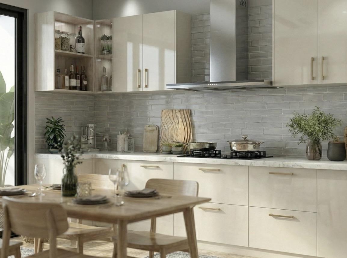
Cream could be best described as a rich and dreamy off-white. It has dominant undertones of yellow and warming gold.
It gives off a buttery, sumptuous vibe. Cream is bright and breezy, with an air of the traditional about it.
This is a colour that brings a cosy feel, adding warmth to any space. It has an inviting feel, adds visual interest and is the perfect backdrop for any kitchen.
Beige
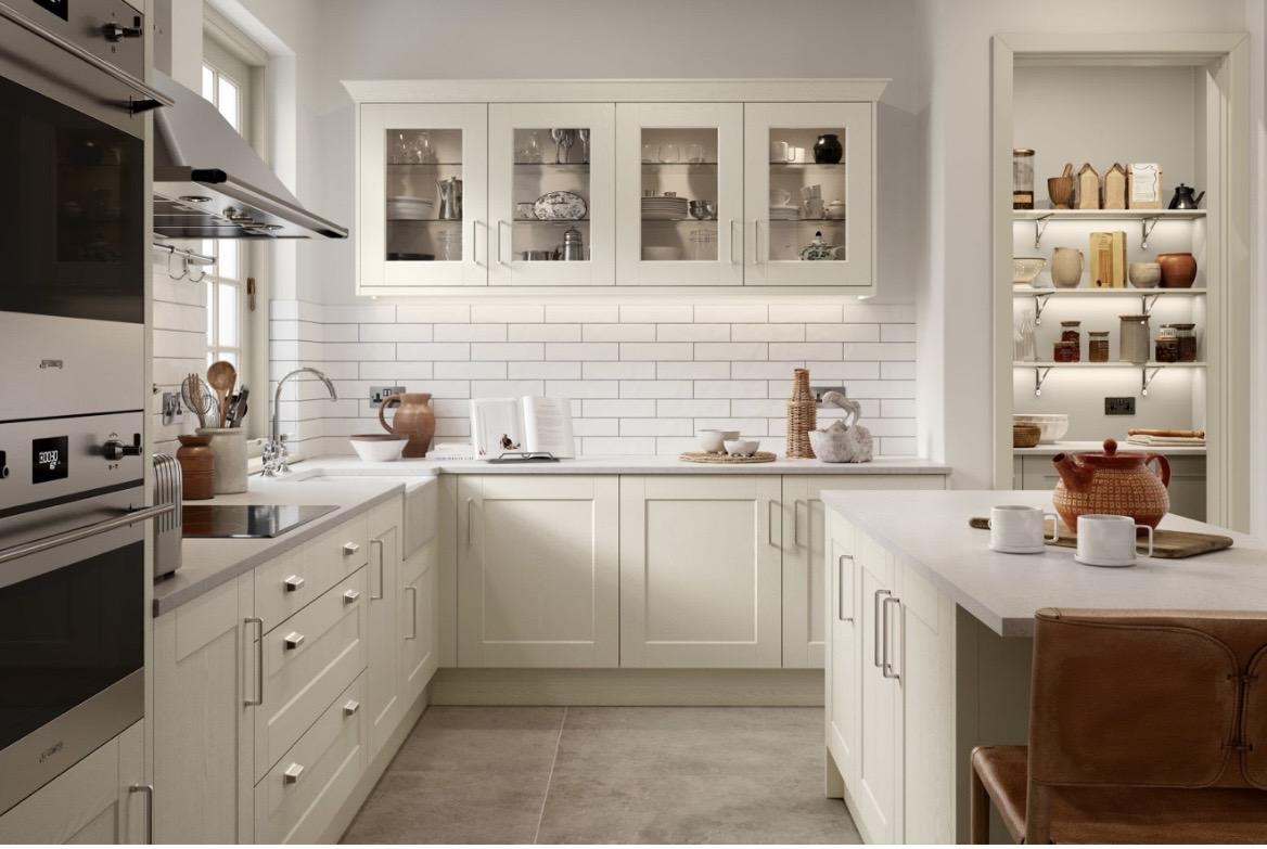
Beige, by contrast, is more of a light brown in complexion – a pale sandy tone. Like cream, it features yellow as a dominant undertone.
However, beige swaps the gold undertones for tones with a hint of both khaki green and grey. The result is a grounded and earthy vibe.
Beige adds depth, a harmonious look, and an airy feel to any interior design.
Cashmere
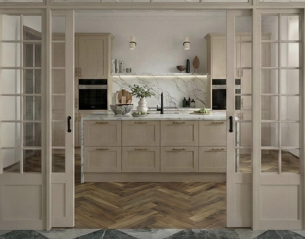
If cream is dreamy, cashmere takes you into the luxury territory. Sometimes labelled as ‘greige’ – a hybrid of grey and beige – cashmere has soft pink undertones and creates an upmarket, but muted, vibe.
Cashmere sits in the sumptuous end of any colour scheme. It brings natural warmth and counteracts darker tones elsewhere in the kitchen.
The Breakdown: Each shade explained
The difference between cream, cashmere and beige ultimately lies in their differences in undertones and depth of colour.
Cream
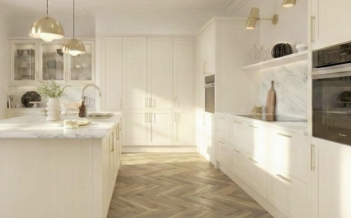
Of the three, cream is definitely the lightest. It sits comfortably in the off-white category. However, due to its yellow base and gold accents , it exudes a much more buttery warmth than most off-whites.
Its hue is bright and reflective. A word of warning though – it can come across as too yellow when under warm lighting.
Other than that slight caveat, cream is a beautiful warm shade and a neutral tone with timeless elegance. This is why cream deserves to be central to many homeowners’ kitchen ideas.
Beige
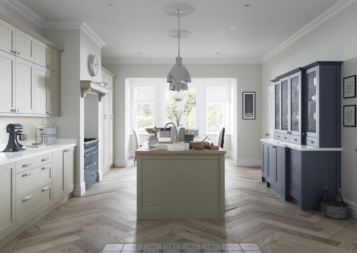
Beige is true classic. It is clearly darker than cream – down to its yellow/brown/slightly grey undertones. Depending on the particular blend of these tones, a beige can still feel quite warm – but it can also give off an air of cool and a more muted, slightly colder air.
It incorporates natural elements in its colour palette, such as sandstone.
Cashmere
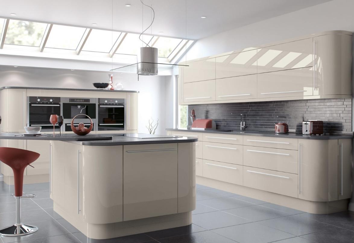
Of the three, cashmere is the most complex tone. Sitting between grey and beige, with a hint of blush pinks, cashmere is an extremely versatile according to the light conditions. This means that it can flow from a soft grey to a warmer taupe tone, as the natural light varies during the day.
Why choose cream for your kitchen?
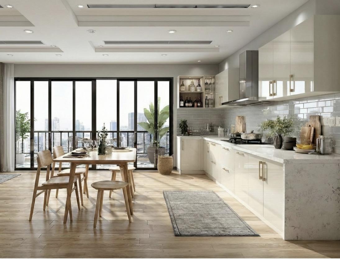
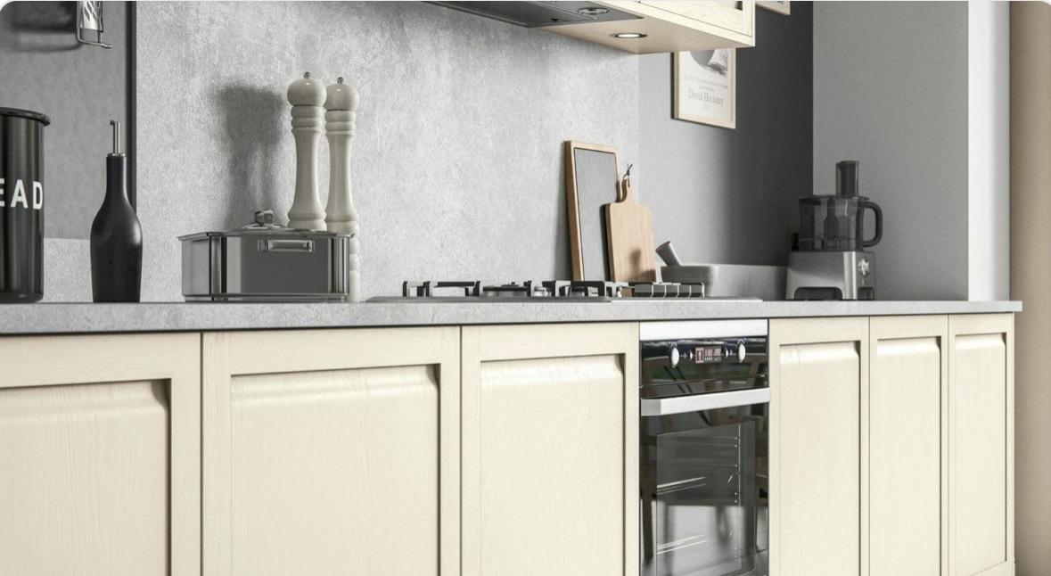
Cream is a neutral shade and therefore a great choice for kitchen cabinets. It has timeless appeal and is a great alternative to the starkness of white. And, as it is softer and warmer than most off-whites, cream is great when partnered with natural wood and stone.
Choosing cream above other colours for your kitchen cabinets makes good sense, as it gives you a distinct aesthetic that will soften the contrast with other elements of your kitchen design.
A dramatic contrast
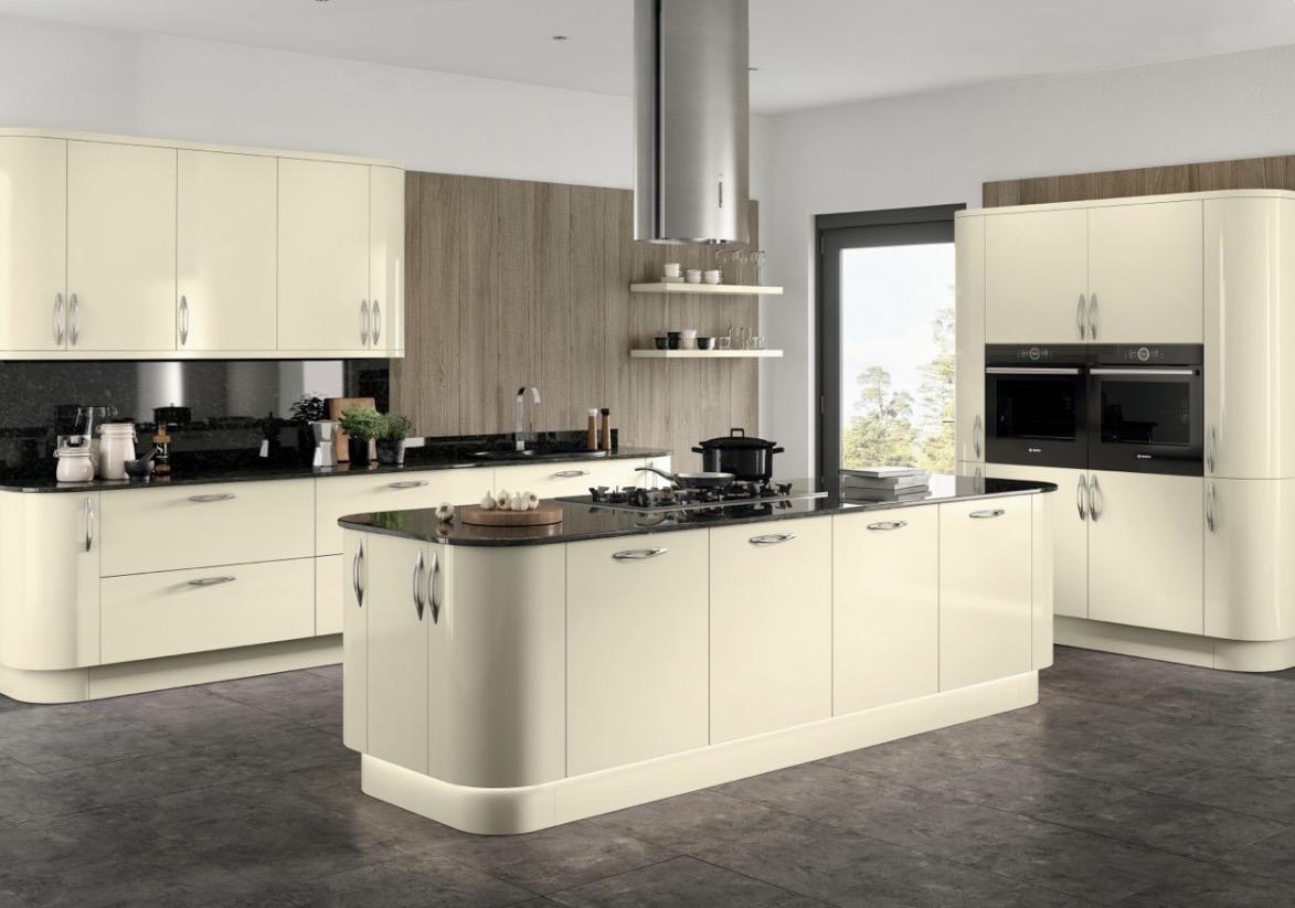
If you have black appliances or darker worktops, cream cabinets are ideal. Cream will give a dramatic contrast to deep blues and blend with industrial designs and matte finishes.
Ultimately, cream is a safe choice for the kitchen but that is no bad thing as it can look simply stunning in the kitchen.
Comforting and family-friendly, cream just makes sense!
Why choose beige for your kitchen?
Beige has enjoyed something of a resurgence in popularity in recent years. This is mainly because it works so well in a range of kitchen styles.
Beige is a great contrast if you have white around the kitchen.
Obviously, white is still an excellent choice of colour for the kitchen. It’s still regarded as the classic kitchen colour. However, an all-white kitchen can sometimes come across as sterile and stark.
Beige saves the day
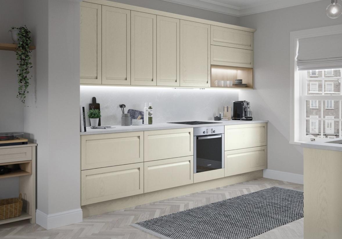
This is where beige comes in to save the day. Beige shades will effortlessly blend with white by introducing another softer and subtle colour dimension.
Beige tones will add a touch of warmth to any space and bring a sophisticated look to the kitchen. Beige is an alternative to the cooler greys and the design elements that have dominated kitchens over the last few years.
Beige is also a smart choice to make small spaces seem larger. This is because beige reflects light rather than absorbing it.
Beige counteracts the starkness of white, but it also complements natural wood or brass handles and fittings.
Introducing beige into your kitchen is future-proofing it. With beige as the baseline canvas, you can easily add different colour accents in the future, if you want to switch things up in the years to come.
Why choose cashmere for your kitchen?
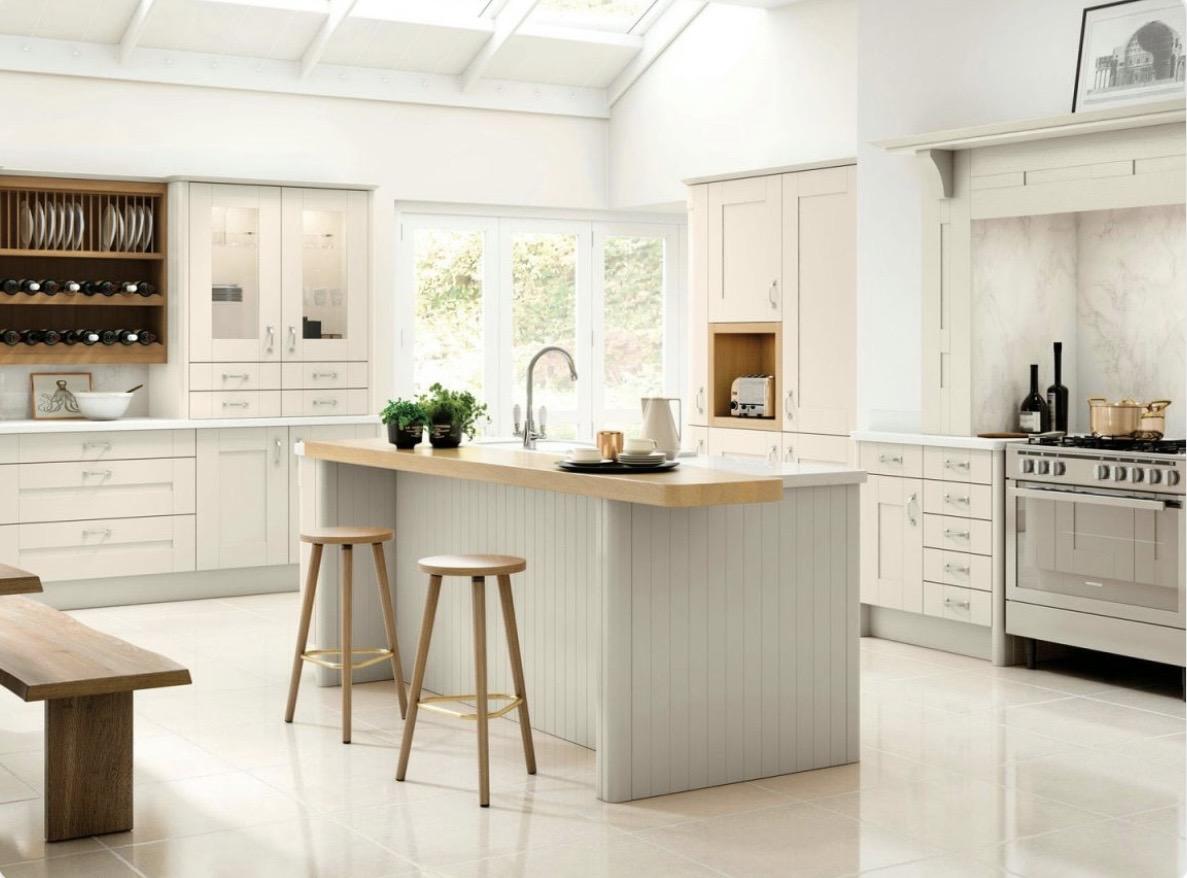
Cashmere kitchen units will work beautifully with a whole host of complementary colours – not least because it is a tone that blends so many colours itself. Cashmere brings delicate touches of pink, beige and green to the party.
It’s the warm neutral with a modern edge. Cashmere makes a kitchen come alive.
But cashmere is much more than a neutral backdrop. Cashmere’s ability to reflect natural light means it can make a smaller, darker kitchen look lighter and larger.
Consider choosing cashmere for your kitchen design during the following scenarios:
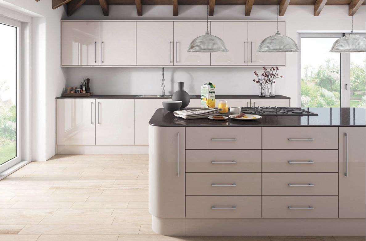
Cashmere has a natural feel and creates an inviting atmosphere. It is also incredibly versatile and adaptable. Cashmere is one of the few colours that looks equally as good on a range of cabinet types.
Adaptable and versatile
It is a tone that works superbly on the ultra-modern look of handleless kitchen doors. But it’s an equal success and inspired choice with Shaker cabinets too, and more traditional looks.
So, cashmere has broad aesthetic appeal and suits virtually all personal tastes.
Luxury kitchens call out for what cashmere offers. It can offer a striking contrast to metallic hardware around the kitchen space -and also bring warm undertones where they are needed.
Cashmere cabinets perfectly complement wooden countertops.
The light and airy feel that cashmere kitchen cabinets bring to any space means that cashmere is popular with homeowners and interior designers alike.
Your dream kitchen
Cream, beige or cashmere could become a classic design in your dream kitchen.
Get in touch with the Kitchen Warehouse team if you have any questions or you would like more advice about which colour to choose.